I Tried to Find the Optimal Investment Portfolio
A common piece of investing advice is that younger investors can afford to take more investment risk.
That sounds reasonable. But it raises a question I had never really thought about: if I can tolerate more risk, should I change what I own, or simply change how much of it I own?
My first instinct was the former. If you want more risk and potentially more return, you move toward riskier stocks.
Then I encountered a different answer in portfolio theory. The theory says that choosing what to own and deciding how much risk to take are two separate problems. First, identify the risky portfolio with the best expected risk-adjusted return. Then adjust your exposure to that portfolio according to how much risk you are willing to take.
It is an elegant result. So I decided to see what happens when you try to do it with real data.
Theory companion: a separate page, "Optimal Portfolio Choice," develops the diversification, efficient-frontier, capital-allocation-line and tangent-portfolio theory in full. This article focuses on what happens when that framework is estimated from real data.
Finding the best mix
I used monthly total-return data for twelve companies across two markets: seven Helsinki-listed names (Nokia, Nordea, Kone, Neste, Sampo, UPM and Fortum) and five S&P 500 names (Apple, Microsoft, Nvidia, Johnson & Johnson and JPMorgan). The U.S. returns were converted to euros using the EUR/USD exchange rate, since that is the currency a Finnish investor actually spends.
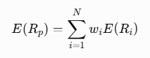
The starting point is diversification. For a portfolio of N assets, expected return is the weighted average of the expected returns of the individual assets:
Risk is different. Portfolio risk depends not only on the volatility of each stock, but also on how the stocks move together:
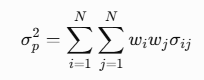
That second equation is why combining assets can reduce risk. Two individually volatile stocks do not necessarily create an equally volatile portfolio if their returns do not move perfectly together. The course material demonstrates the same result in the two-asset case: adding some of the riskier stock can actually lower the volatility of the total portfolio because of diversification.
The real data makes this concrete, though less dramatically than I expected. Over this period, the average pairwise correlation was about 0.28 among the seven Finnish names and about 0.39 among the five U.S. names, versus about 0.26 between a Finnish name and a U.S. name. A decade of global markets being pushed around by the same macro events (a pandemic, a rate-hiking cycle) leaves its mark: crossing the Atlantic lowers the average correlation a little versus the U.S. names on their own, but it does not come close to zero. Diversification still helps. It is not the free lunch the two-asset textbook example makes it look like.
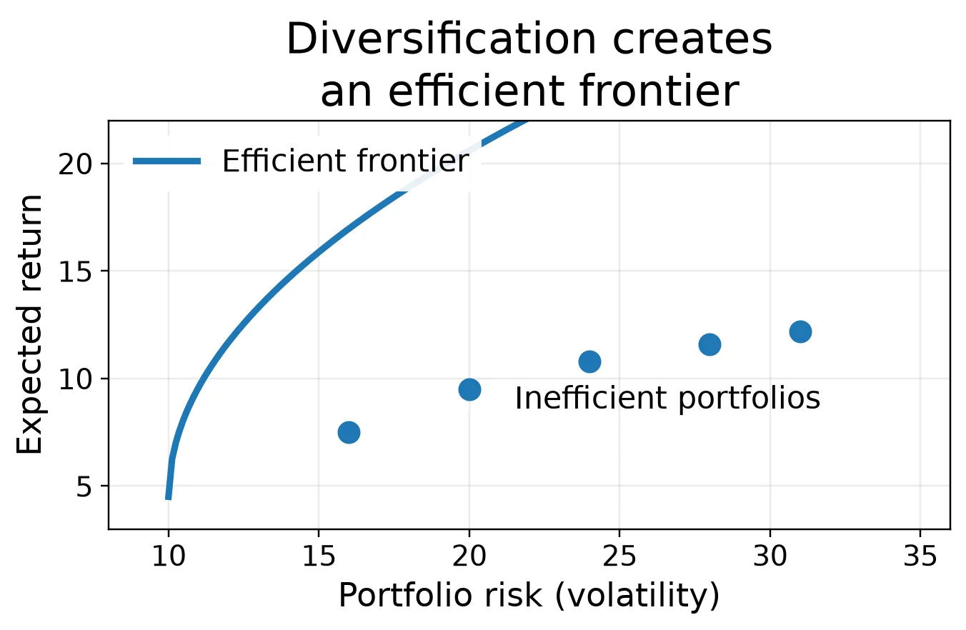
The geometry is easiest to see in a simple risk-return diagram. Put portfolio volatility on the horizontal axis and expected return on the vertical axis. Different combinations of risky assets produce different risk-return combinations. Some combinations are dominated by others.
The important part is the upper boundary: the efficient frontier. A portfolio below that frontier is inefficient because another available portfolio can provide either a higher expected return for the same risk or less risk for the same expected return.
So it seems that an aggressive investor should simply move further up the efficient frontier. But something interesting happens when we introduce a risk-free asset.
One portfolio is special
Suppose an investor can also hold a risk-free asset earning a return of Rf. We can draw a line from that risk-free return to any portfolio on the efficient frontier. The slope of that line is:
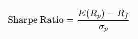
The Sharpe ratio measures the expected excess return of a portfolio relative to its volatility. A steeper line is therefore better: more expected excess return for each unit of risk.
There is one portfolio where the line from the risk-free rate is as steep as possible. The line touches the efficient frontier at exactly that point. That is the tangent portfolio. Mathematically, the problem is:
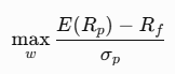
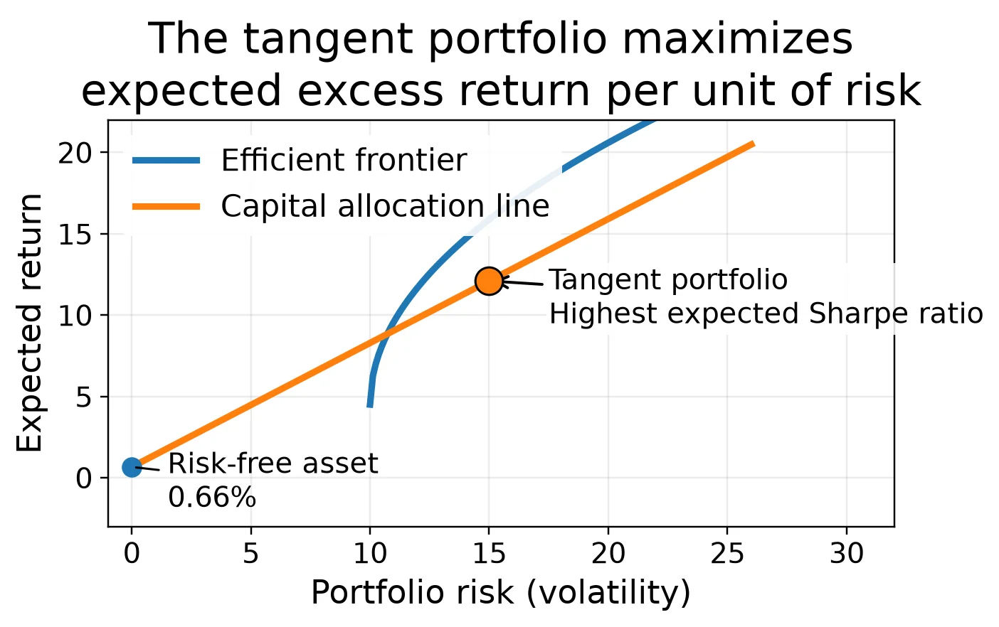
In the standard mean-variance model, the tangent portfolio is the risky portfolio that maximizes expected excess return per unit of volatility.
This changes the original question. Instead of asking each investor to choose a different portfolio of risky assets, the theory separates the decision into two stages. First: what is the risky portfolio with the best expected risk-adjusted return? Second: how much of it should I own? Within this mean-variance framework, the answer to the first question is the tangent portfolio: the risky portfolio with the highest expected Sharpe ratio. Risk tolerance answers the second.
Change how much, not what
Let x represent the proportion of the investor's wealth allocated to the tangent portfolio, with the remainder invested in the risk-free asset. Expected return becomes:
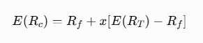
And volatility becomes:
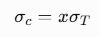
This produces a surprisingly simple result. A cautious and an aggressive investor can own exactly the same portfolio of risky assets. What changes is their exposure to it.
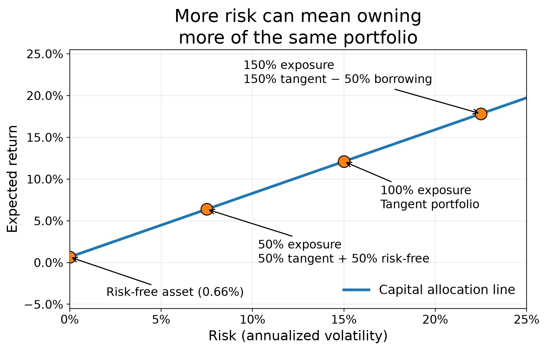
An investor at 50% exposure puts half of their money in the tangent portfolio and half in the risk-free asset. At 100%, the investor holds the tangent portfolio itself. In the theoretical model, an investor wanting still more risk can borrow at the risk-free rate and invest more than 100% of their wealth in the tangent portfolio.
This is the separation result: within the textbook model, investors can hold the same optimal risky portfolio while choosing different overall risk levels through their allocation between that portfolio and the risk-free asset.
So portfolio theory gives a surprisingly neat answer to my original question: in the textbook model, wanting more risk does not require buying riskier stocks. Investors can instead change their exposure to the same optimal risky portfolio.
At this point, I thought I had my answer. Then I tried to calculate that portfolio.
The problem hiding inside the theory
To find the tangent portfolio, we need inputs. For every stock, we need an expected return. We need its volatility. And we need to know how its returns covary with every other stock.
The problem is that these quantities, especially expected returns, are not known in advance. They have to be estimated. Historical data can inform those estimates, but it cannot reveal future expected returns.
So I estimated the inputs from historical returns. Using the full sample produced a perfectly respectable-looking answer: a precise set of portfolio weights and a portfolio with a higher in-sample Sharpe ratio than any of the twelve individual stocks.
But there is an obvious problem with doing that. I already know the entire history. An investor standing in 2020 did not have the data from 2021, 2022 or 2023.
So I tried something closer to the actual problem an investor faces. I estimated the portfolio using rolling three-year windows and moved the window forward through time. The result was much less elegant.
Using the three years ending in May 2020, the optimizer wanted roughly 76% Microsoft, 20% Neste and 4% Kone, over three quarters of the entire portfolio in a single American stock. Move forward to the three years ending in January 2023 and Microsoft is gone entirely: Johnson & Johnson leads at 65%, with Nvidia at 25% and Nordea at 10%, a defensive healthcare stock nobody would call exciting dominating the "optimal" portfolio. By the three years ending in January 2025, it had reshuffled again, to roughly 39% Sampo, 37% JPMorgan and 24% Nvidia, with nothing left of the names that led either earlier window. Across the windows, the optimizer kept concentrating most of the portfolio in two or three names at a time, and which names those were kept changing, often crossing the Atlantic entirely between one window and the next.
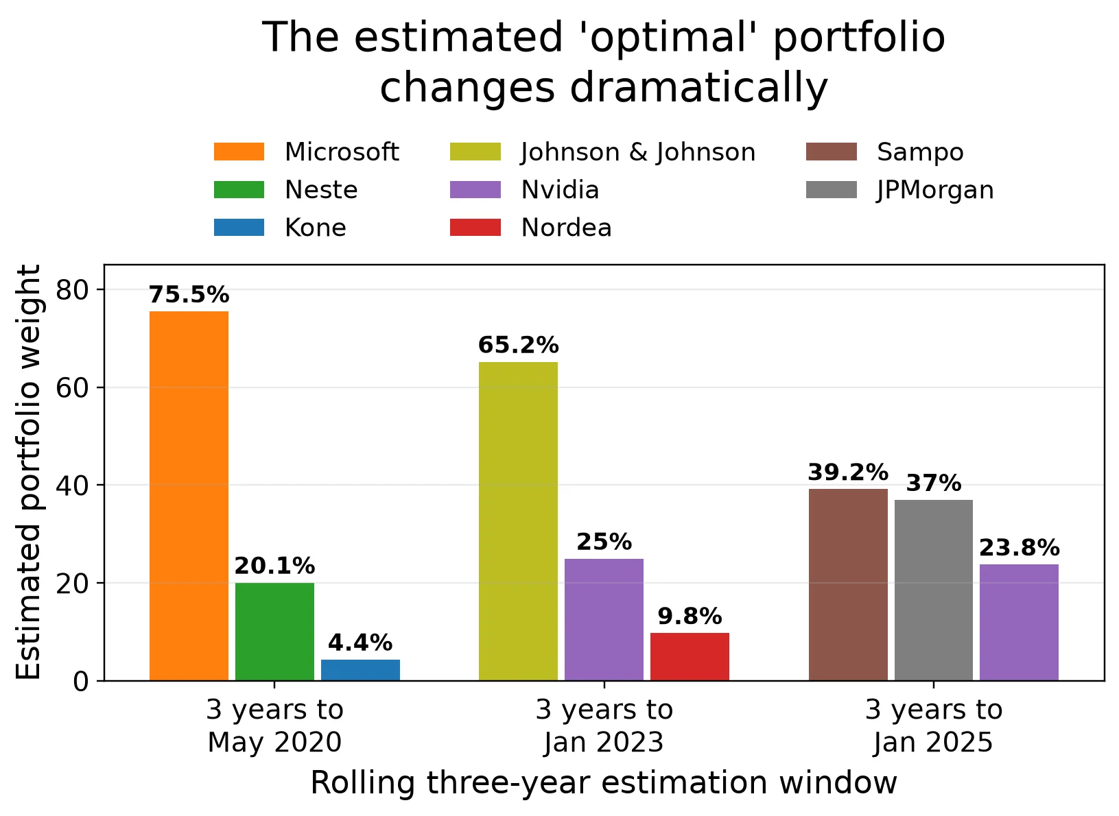
The companies had not changed that dramatically. The estimates had. And because the optimizer treats these estimates as inputs, relatively small changes in estimated expected returns and covariances can produce large changes in the portfolio it calls optimal.
That is where I think the distinction between theory and implementation becomes important. The existence of a theoretical tangent portfolio is not the problem. Knowing which portfolio it is ahead of time is.
Does all that optimization actually help?
There is one obvious way to test this. Estimate the portfolio using only information that would have been available at the time, then see how it performs afterward.
So for each estimation window, I calculated the portfolio using historical data and evaluated it using subsequent returns. I compared that approach with an intentionally simple alternative: dividing the money equally across all twelve stocks.
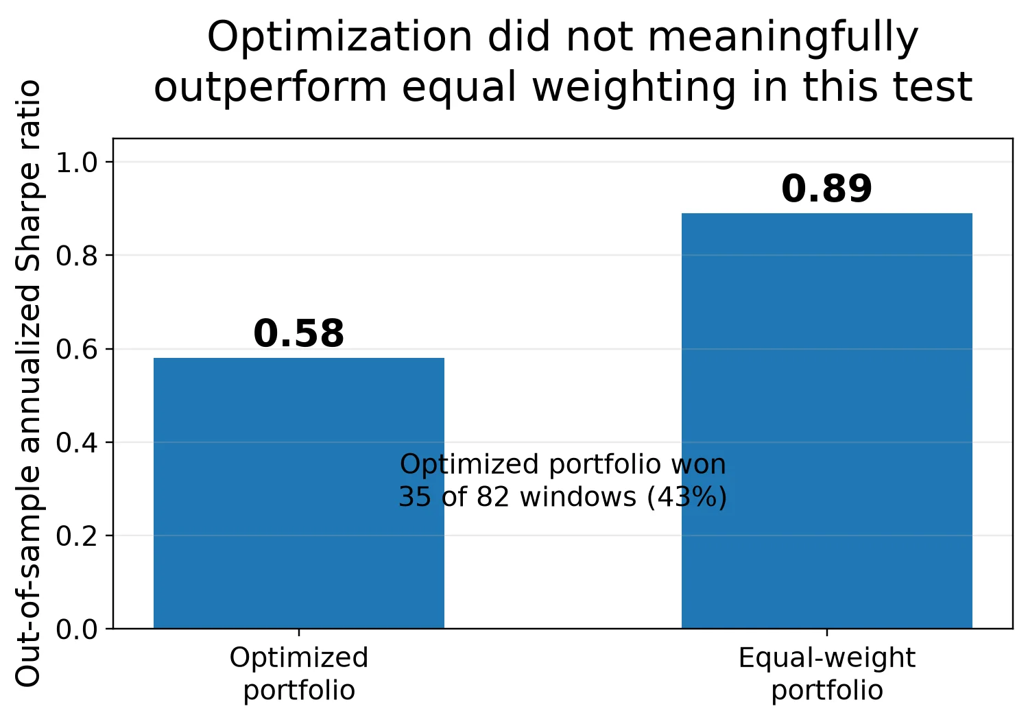
The optimized portfolio did not outperform the simple benchmark. In my test, it beat the equal-weight portfolio in 35 of 82 windows (about 43%), and on a risk-adjusted basis it was clearly worse: an annualized out-of-sample Sharpe ratio of about 0.58, against 0.89 for the equal-weight portfolio, while also taking on more volatility.
In other words, for this dataset, optimization did not meaningfully outperform equal weighting, it underperformed it. Adding a second market to the universe gave the optimizer more inputs to be precise about, not more reason to trust the precision.
That does not prove that portfolio optimization does not work. Twelve stocks across two markets over roughly a decade is still a limited experiment, and overlapping windows are not independent observations. But that limitation is part of the lesson. The optimizer can produce weights to several decimal places. That does not mean our knowledge of the future is equally precise.
What survived the experiment
I started this exercise expecting the interesting part to be finding the optimal portfolio. I ended up thinking the more useful insight was the distinction that came before it. What you own and how much risk you take are different decisions. Portfolio theory makes that distinction unusually clear.
If we somehow knew the true expected returns and covariance matrix of the available assets, we could construct the tangent portfolio and then adjust our exposure to it according to our willingness to take risk. The mathematics is elegant. The difficulty is that we do not know those inputs.
So I would not interpret my experiment as showing that the tangent portfolio is wrong. I would interpret it as showing how careful we should be when a model built on uncertain estimates gives us an extremely precise answer. There is a difference between an optimal portfolio and our estimate of the optimal portfolio. That difference turned out to be the most interesting part of the exercise.
My takeaway is not that optimization is useless. It is that diversification is much easier to trust than precise optimization. The benefit of combining imperfectly correlated assets does not require me to know their future returns precisely. Finding the exact portfolio that maximizes expected Sharpe ratio does.
And it changed how I think about the original question. Being young, having a long investment horizon or simply being comfortable with volatility may be reasons to accept more risk. But that does not automatically mean searching for individually riskier stocks. The cleaner question is: how much exposure should I have to a well-diversified risky portfolio?
Portfolio theory gives a beautiful framework for answering that question. Finding the supposedly perfect portfolio to plug into it is another matter entirely.
Figure note. The first three figures are original conceptual illustrations of the textbook model. The later figures report results from the empirical exercise described in the text.
Data, methodology and limitations
The analysis uses monthly total returns for twelve stocks from October 2015 to August 2025: seven Helsinki-listed names (Nokia, Nordea, Kone, Neste, Sampo, UPM, Fortum) and five S&P 500 names (Apple, Microsoft, Nvidia, Johnson & Johnson, JPMorgan). Prices are dividend-adjusted. The U.S. names were converted from USD to EUR each month using the EUR/USD exchange rate over the same period, so their returns and correlations reflect currency movements as well as business performance. The risk-free rate is the average three-month Euribor over the period (0.66% per year). Portfolios are long-only.
The rolling exercise estimates portfolio inputs from 36-month historical windows and evaluates the subsequent month's return, stepping forward one month at a time. That produces 82 evaluation windows, which overlap, so they should not be interpreted as 82 independent tests. The exercise is still deliberately small and illustrative: twelve stocks, two markets and roughly one decade of data.
The theoretical framework follows standard mean-variance portfolio theory as presented in Berk and DeMarzo. The empirical exercise is an illustration of estimation risk, not a claim that optimization is generally ineffective.
Past returns are not forecasts of future returns. Nothing in this article is investment advice.